
Building a Website in a Day (No Code Needed)
Websites 101
Do you have a company? A side hustle? Anything, really, that you’d like to share with the wider world? If you have something worth sharing, a website can help anyone find it.
Most people think that to make a website that doesn’t look half bad, you need to do complex coding and development while using intimidating things like color theory and design. In reality however, it’s significantly simpler. Using no code at all, I’ll teach you how to make a simple, beautiful website that can fit your needs in under a day.
The Grocery List.
To do this, you’ll need a few (free) tools.
-
Wix. Their website designer is free, easy, and smooth.
-
A Domain (Optional). To stand out, you need your own domain name. Sounds confusing? It’s really not. That’s just the URL of your site. Think “google.com” or “youtube.com.”
-
An Idea. You shouldn’t just go in blind. Think of what you want.
That’s all you need to make your own, fully-fledged website.
Step 0: What Exactly Are We Doing?
When designing a website, you need a plan. For a website to be good, it needs to be focused (at least generally). Answer the question “What exactly are we doing?” in this step.
For example, I’m a photographer. Say my answer to that question is “I help local businesses with clean product shots.” That’s my website then. I should focus on that, specifically, because that’s why people will be coming to my website.
Step 1: The Beginning.
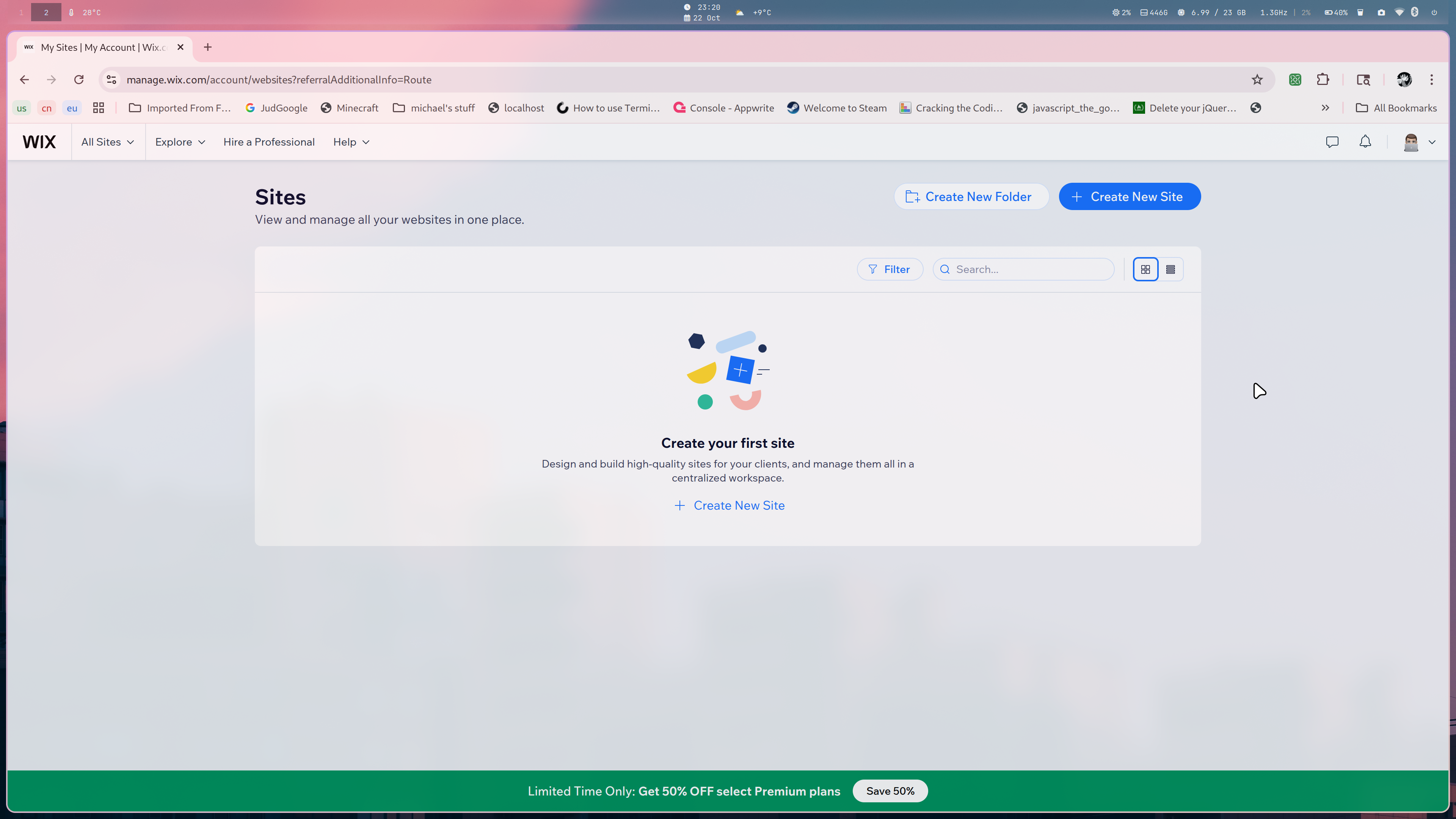
First, navigate to Wix.com and create an account. Navigate to sites, a page that looks like this.
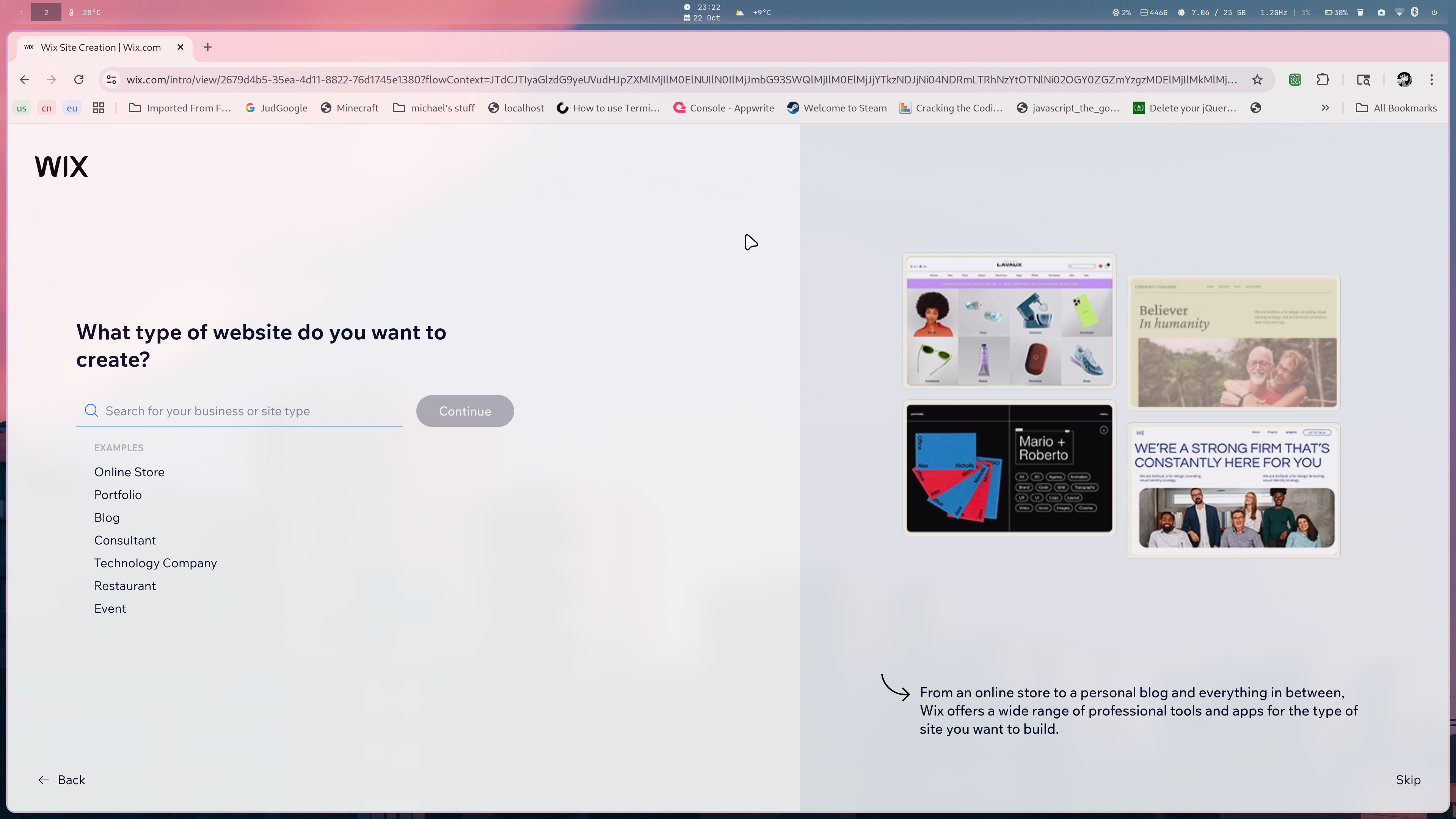
Next, create a site, and choose the site matching your last question best. It should look like this.
Finally, navigate to templates, and choose the template that calls to you the most.
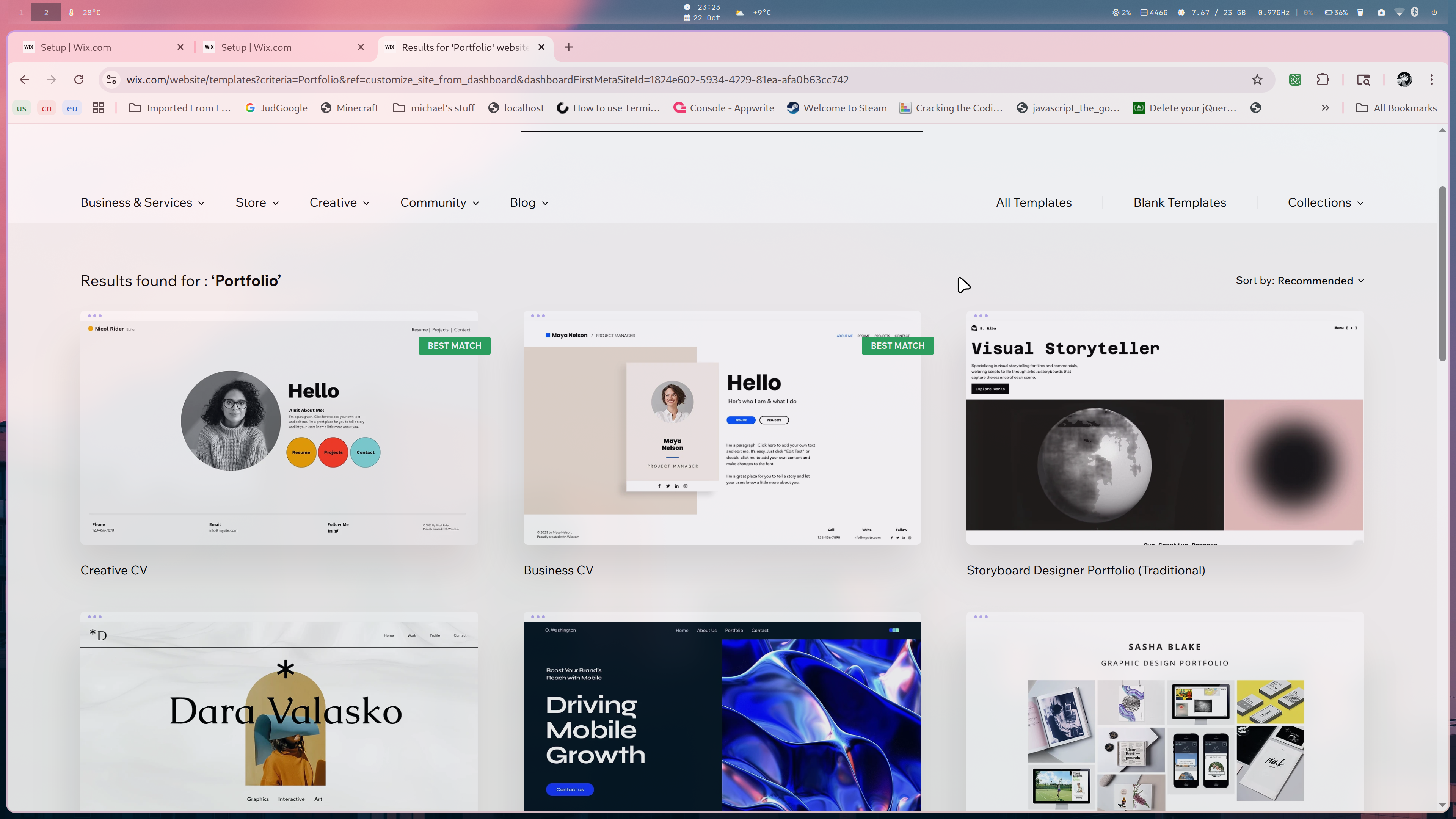
For this tutorial, I’ll choose the pastel creative one for portfolios. You may choose another one.
Now that we’ve got what we want and need exactly, we can move on.
Step 2: Structure, Simply.
Structure is incredibly important to websites, yet it oft goes unnoticed. Sites like Apple use structure to draw users directly into their products, and how to buy them. Sites like Google direct the user immediately to the search bar by positioning it front and center. This isn’t by accident.
In general, you’ll want 3 essential parts:
-
The Header
-
The Body
-
The Footer.
The header shouldn’t draw user’s attention too much. It should contain navigation and a headline.
The body is where most of the content will lie. This is what you want the user to see immediately, interact with, and more. It’s the main portion of the website and the most important. Focus on this portion specifically.
The footer is the last part the user will see and the least important. It’s optional, but in general, it’ll include contact info, directories, and little more.
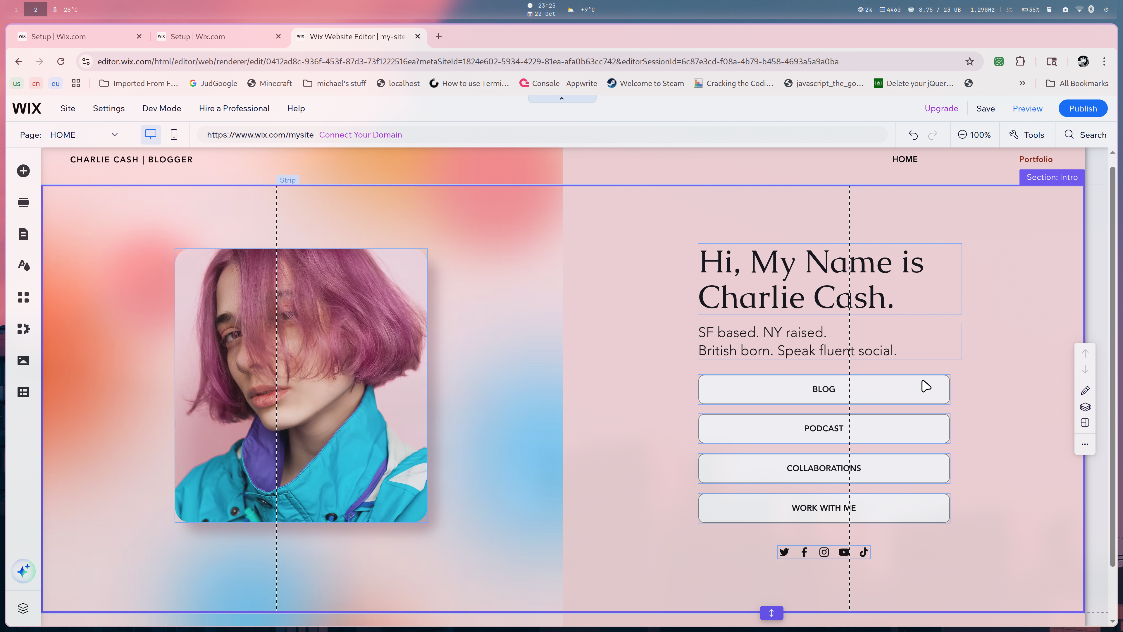
This is an example of the structure of the body of our chosen portfolio. We see its divided into two portions: an example of work, and the portion the user will interact with. By centering both and dividing them clearly, we essentially create two portions the eye will naturally look to as the page first loads. Since its a portfolio, we place our work front and center, along with how to see more. Then above and below, we place our short bio and contact info. By positioning these elements strategically, we create an order of importance in the user’s mind, and improve the flow and feel of the website without even doing anything.
Step 3: Text, Fonts and Colors.
When designing a website, you might not really think about the font you use, or that it’s really that important compared to other things, or you might not really think about things like color and consistency either. In reality however, typography is one of the most important parts of web design and using it well can communicate tons of information to the user without even saying anything explicitly.
For example, take Apple again.
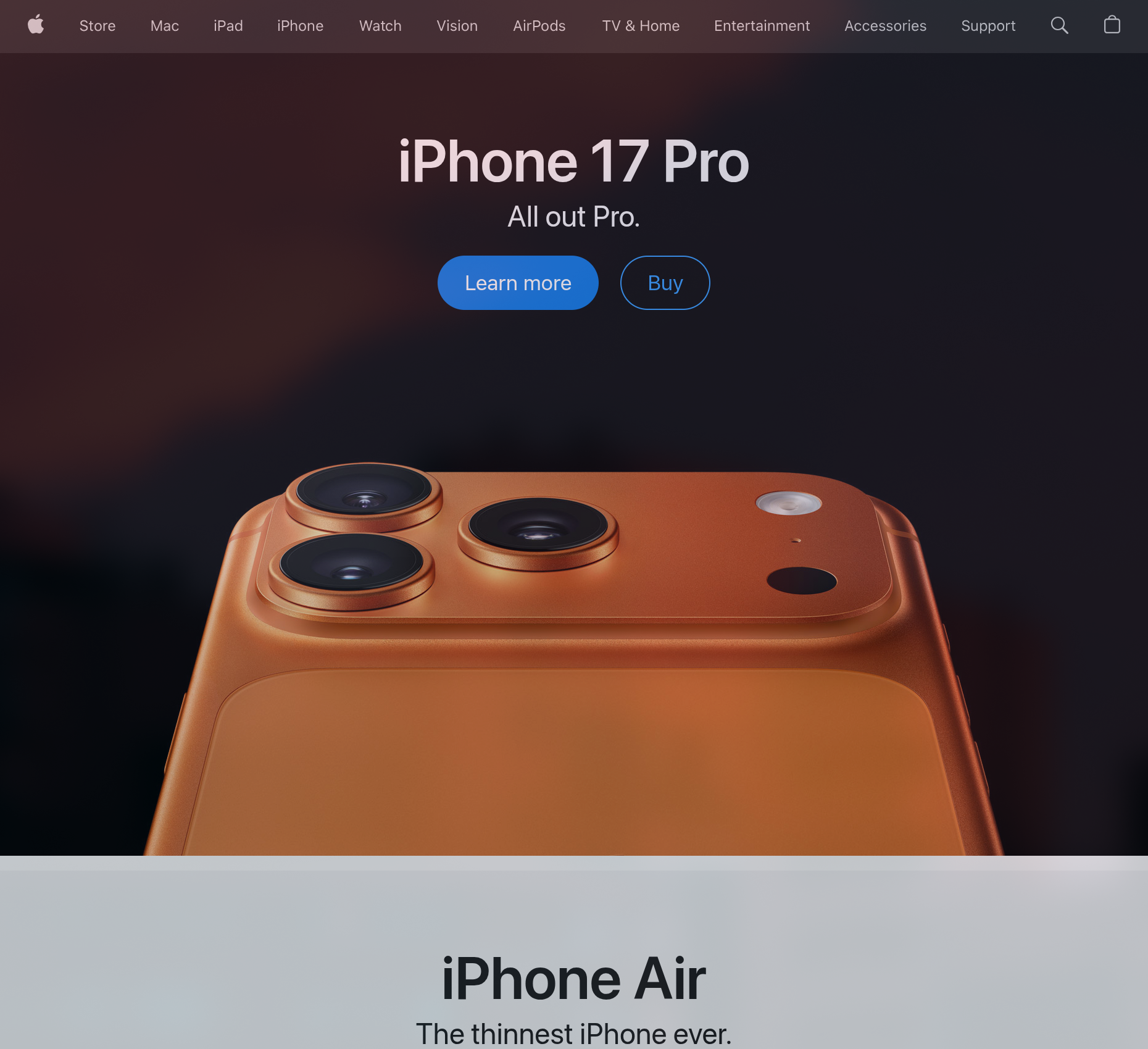
Their text is clean, smooth, and minimalistic, much like their phones that they sell, and the coloring is simple. Let’s change those and see what that does to thier website.
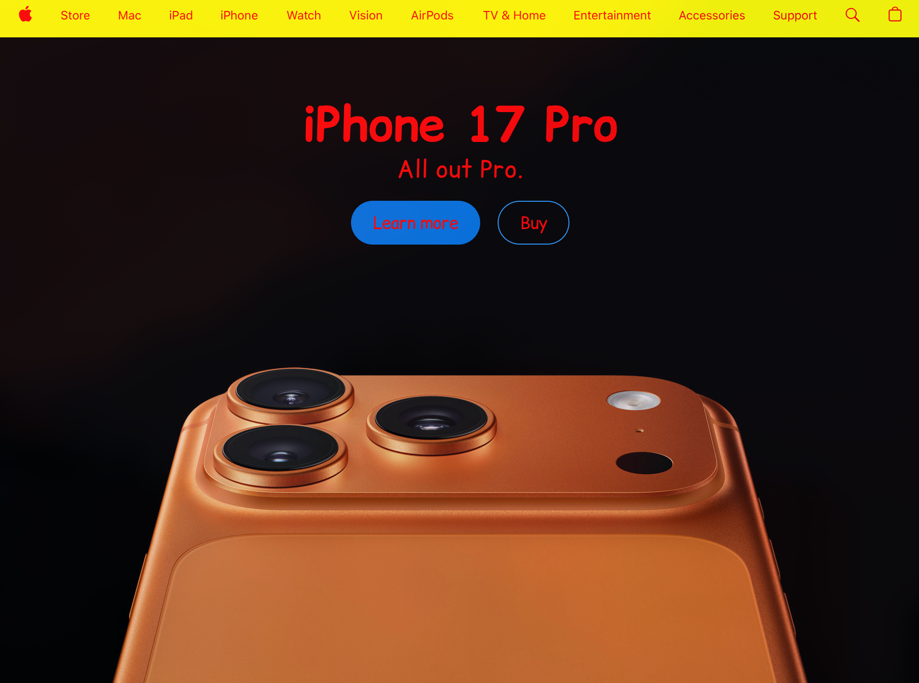
Back to our website again, when chosing colors and fonts, along with things like text setting, line height, line width, and more, think about what you’re communicating and how you are. How your text and site looks communicates tone just as much as the text itself. If it’s a children’s site or deals with entertainment, you don’t have to take such a serious tone. But if it’s a funeral home, you shouldn’t have a mustard yellow background with poppy blue text everywhere.
On Wix, to change font, color, and more, you can simply click on the elements you wish to edit, like text, and select edit text, where a dropdown will appear and you will be able to make your edits. When styling, we generally want to stick to 1, 2 or maybe 3 different fonts for the header, body, and footer respectively, and we want to focus on only 3 sizes ideally:
-
H1, or the main header/title
-
H2, or the subtitle/subheader
-
P, or the paragraph, body text. This is the smallest.
As a rule of thumb, you generally also want to keep coloring simple, matching it with the respective fonts or sizes. Use analogous colors for things that go next to each other, and complementary for things that stack, like black text on a white background.
Step 4: Images and Other Media.
When using media on a website, our goal is to augment the text. We want to support the main message without slowing down or confusing the user, allowing for a seamless communication of our point to them.
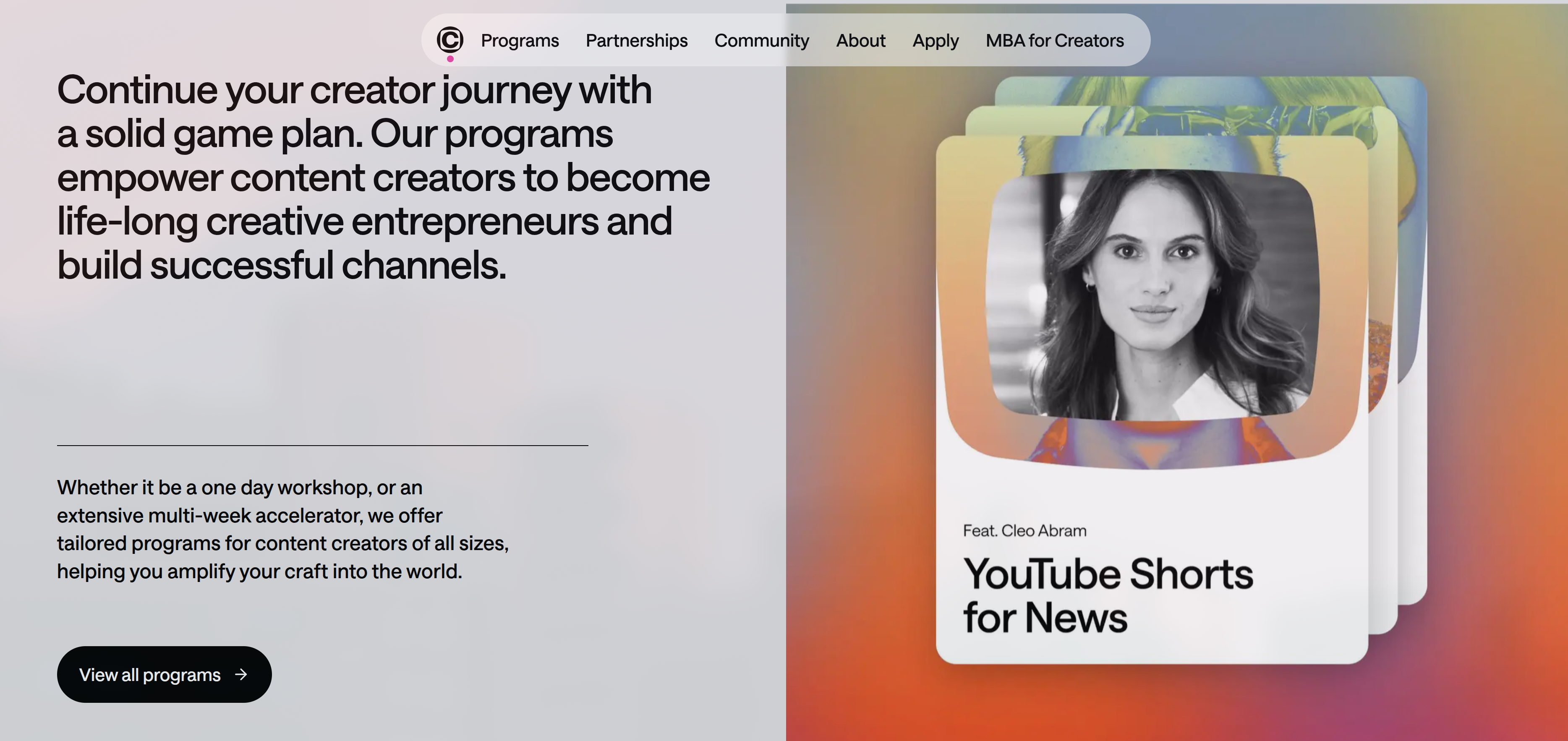
Changer https://www.changerstudios.com/ is a great example of this. Here, the images on the side aid the text visible, backing their text by giving an example of who they’ve helped while matching the same style as the rest of the site. It adds on perfectly to what they’re talking about, while not being cluttered or distracting.
When using images, videos, and other media, we want to match our style while not being too loud or explicit. The goal with media is to aid, not to be flashy. For example, say we want to add images to our home page for a plumbing service. While we can just stick an image of a plumber in the middle of a paragraph, that probably isn’t the best place to put it, compared to on the sides or someplace else. By placing our media thoughtfully, we can prevent the user from being distracted while adding onto our text and our message perfectly.
With images and videos, another thing to consider is size. While a 20 megabyte image might not seem that bad, we have a whole website to load. Target small, compressed images so that even people with slower Wi-Fi can access your site, using things like JPEGs or WEBPs so that you lose minimal quality with compression.
Step 5: Publishing.
Now that you’ve designed your site to the level and quality you want, it’s time to launch.
Luckily with Wix, publishing is as easy as pushing a single button.

Unfortunately, going online is only half of the publishing process. Fortunately, Wix also makes this part just as easy. Navigate to “Get Found On Google” on your dashboard, and you’ll be presented with a basic questionnaire. After answering that, you’ll see your SEO Checklist.
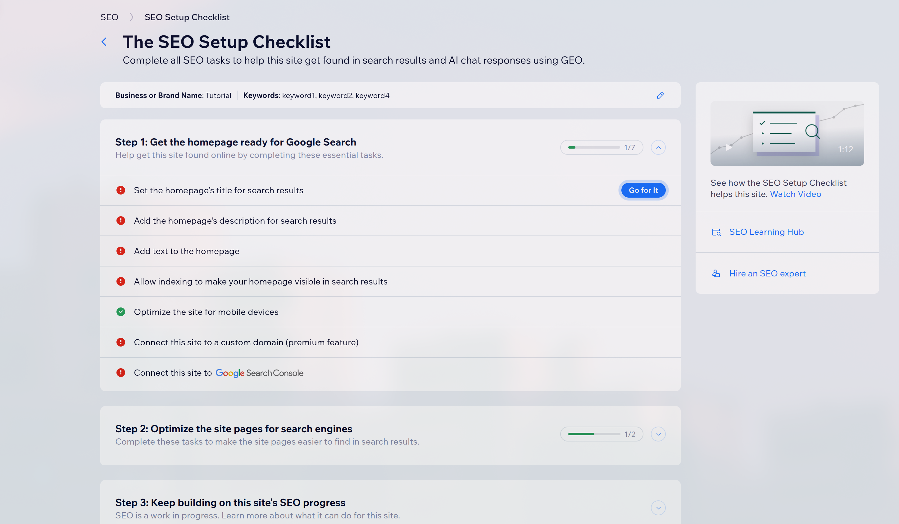
SEO stands for “Search Engine Optimization.” In more basic terms, that just means if someone googles your business, how far down are they gonna have to go to see you? You can make them find your site easier by advertising, obviously, but you can also perform SEO optimization. This includes things like targeting key words (e.g. your location, what you do, etc.), use the title of your site to be descriptive and clear to potential users, and putting high quality content on your site, so people actually go to it and spend time on it. After completing this checklist, you’re nearly done with creating a great website.
The Once-Over.
While your site may look good on your specific computer, chances are that most people won’t be using your specific computer to see it. Use things like your phone, tablet, or even a laptop/desktop to see how your website looks in different scenarios. For example, if it looks really good on desktop but not so great on mobile, you might want to fix that.
Another thing to do is minimize clutter, both literally and design-wise. If you have too many fonts, sections, and colors all throughout, it starts to become an eyesore to the user unless done properly. Consistency and simplicity can go a very long way. Meanwhile, literal informational clutter is something you should heavily avoid, as it can confuse the user, and draw them away from your site.
Finally, make sure to do things like testing all links, buttons, navigation, and everything that can break. In general, with software engineering, anything that can break, will break. If you’ve ever experienced buggy products, I’m sure you know how annoying it can be to deal with. To prevent frustrating, confusing, and annoying the user, make sure to test everything on your site at least once just to be sure it’s working and not broken.
Afterword.
And with that, you’re finally done. Now that you’ve tested your website, published it to the wider web, and designed it so it looks great to anyone who stumbles across it, you’re mostly finished. That being said, what you ship today doesn’t need to be perfect. Web development and design is iterative, and you’ll probably find yourself tweaking little portions here or there as you see fit. As long as you follow the general structure and rhythm of good websites, you can build and do almost anything you want.
You’ve finished designing a site, making it usable and approachable, and publishing it to the web in just a day now, without even needing to ever look at code. That’s more than most people manage to get done in a week. Now that you’ve got the first revision down, focus on what users who visit use, like, and don’t like, and use that to further optimize and change your site as needed. All that’s left now is to go out and get some clicks.